カスタマイズ依頼がありました。
「スマホで目次を右下に配置し、いつでもメニューのように開きたい」とのことです。
WordPressテーマのJINとSANGOでの実装希望でしたが、
当ブログはCocoonなのでついでにCocoonでもやってみました。
ですので、当ブログで動作確認ができます。スマホで見てみてください。
今回はそれぞれのテーマでやり方が異なるので3つの記事に分けます。
- style.css
- function.php
2019/9/5 12:00:JavaScript 22行目修正
2019/9/24:CSS追記、変更
JINでスマホ時に目次を追尾させる方法!
手順は以下の通りです。
- STEP1CSSコピペstyle.cssにコードをコピペします。
- STEP2PHPコピペfunction.phpにコードをコピペします。
- STEP3JavaScriptコピペHTMLタグ設定にコードをコピペします。
- STEP4ウィジェット追加ウィジェットを設定します。
基本的にコピペでできますが色を変えたり位置を調整するには自身でやっていただきます。
STEP1:CSSをコピペ!
下記コードをコピペしてください。
「外観→テーマエディター→style.css(子テーマ)」。もしくは、「外観→カスタマイズ→追加CSS」に貼り付けてください。
/************************************
** スマホ追尾目次
************************************/
#mobile-toc-widget-wrap .menu-trigger,
#mobile-toc-widget-wrap .menu-trigger span {
    display: inline-block;
    transition: all .4s;
    box-sizing: border-box;
}
#mobile-toc-widget-wrap .menu-trigger {
    position: relative;
    width: 25px;
    height: 35px;
}
#mobile-toc-widget-wrap .menu-trigger span {
    position: absolute;
    left: 0;
    width: 100%;
    height: 3px;
    background-color: #fff; /* 三本線色 */
    border-radius: 4px;
}
#mobile-toc-widget-wrap .menu-trigger span:nth-of-type(1) {
    top: 13px;
}
#mobile-toc-widget-wrap .menu-trigger span:nth-of-type(2) {
    top: 20px;
}
#mobile-toc-widget-wrap .menu-trigger span:nth-of-type(3) {
    top: 27px;
}
#mobile-toc-widget-wrap .menu-trigger.active {
    -webkit-transform: rotate(360deg);
    transform: rotate(360deg);
}
#mobile-toc-widget-wrap .menu-trigger.active span:nth-of-type(1) {
    -webkit-transform: translateY(20px) rotate(-45deg);
    transform: translateY(20px) rotate(-45deg);
    top:0;
}
#mobile-toc-widget-wrap .menu-trigger.active span:nth-of-type(2) {
    -webkit-transform: translateY(0) rotate(45deg);
    transform: translateY(0) rotate(45deg);
}
#mobile-toc-widget-wrap .menu-trigger.active span:nth-of-type(3) {
    opacity: 0;
}
#mobile-toc-widget-wrap{
    position: fixed;
    bottom: 60px;
    right: 80px;
    margin: 0;
    padding: 0;
    z-index:5;
    counter-reset: mobile-toc;
}
#mobile-toc-widget-wrap label .mobile-toc-button {
    width: 58px;
    height: 58px;
    border-radius:50%;
    background: #b2e086; /* ボタン色 */
    box-shadow: 0px 2px 6px rgba(0, 0, 0, 0.16);
    transition: ease-out 0.3s;
    text-align:center;
    position:relative;
    z-index: 3;
}
#mobile-toc-widget-wrap label .mobile-toc-button .mobile-toc-button-title {
    color: #fff; /* ボタン文字色 */
    font-size: 0.65em;
    letter-spacing: 0;
    position: absolute;
    bottom: 7px;
    left: 0;
    right: 0;
    margin: auto;
}
#mobile-toc-widget-wrap label:hover {
    background: #efefef;
}
#mobile-toc-widget-wrap input {
    display: none;
}
#mobile-toc-widget-wrap .mobile-toc-show {
    display:none;
}
#mobile-toc-widget-wrap input:checked ~ .mobile-toc-show {
    background:#fff;
    position: absolute;
    top: 0;
    left: 0;
    padding: 2.5em 1em;
    opacity:0.97; /* 20190924数値変更 */
    position:fixed;
    width:100%;
    height:100%;
    display:block;
    animation: 0.5s fade-in;
    -webkit-animation: 0.5s fade-in;
    overflow-y:scroll;
}
@-webkit-keyframes fadeIn {
  0% {display: none;opacity: 0;}
  1% {display: block;opacity: 0;}
  100% {display: block;opacity: 0.93;}
}
@keyframes fade-in {
  0% {display: none;opacity: 0;}
  1% {display: block;opacity: 0;}
  100% {display: block;opacity: 0.93;}
}
#mobile-toc-widget-wrap .widgettitle{
    text-align: center;
    margin: 0 0 1em;/* 20190924数値変更 */
    color: #f6a068; /* 目次名の色 */
    font-size: 1.1em;
    letter-spacing:2px;
    font-weight:600;/* 20190924追記 */
}
#mobile-toc-widget-wrap .toc_widget_list{
    font-size:0.8em;
    padding:0 !important;
}
#mobile-toc-widget-wrap .toc_widget_list a{
    text-decoration:none;
    color:#555; /* 目次リストの色 */
    font-weight:600;/* 20190924追記 */
}
#mobile-toc-widget-wrap .toc_widget_list > li {
    list-style-type: none !important;
    position: relative;
    margin-left: 13px;
    margin-right: 25px;
    padding-left: 32px;
    margin-bottom: 15px;
    padding-bottom: 0px;
    font-size: 1.1em;
    line-height: 1.8;
}
#mobile-toc-widget-wrap .toc_widget_list > li:before{
    counter-increment: mobile-toc;
    content: counter(mobile-toc);
    position: absolute;
    left: 5px;
    top: -1px;
    background: none;
    font-size: 1.1em;
    color: #f6a068; /* 数字の色 */
}
#mobile-toc-widget-wrap .toc_widget_list > li ul {
    margin-top: 5px;
    padding-left: 20px;
    list-style:none;
}
#mobile-toc-widget-wrap .toc_widget_list > li > ul > li a {
    position: relative;
    text-decoration: none !important;
    font-weight:300;/* 20190924追記*/
}
#mobile-toc-widget-wrap .toc_widget_list > li ul li a:before {
    position: absolute;
    content: "・";
    font-size: 1.4em;
    left: -20px;
    top: -10px;
    color: #f6a068; /* 点の色 */
}
色を変えられる箇所にコメントを書いたので色を変更したい場合はカラーコードを変更してください。
EasyTOCを使ってる方はtoc_widget_listをez-toc-listに変更してください!
ボタンの位置を調整してください
フッターの表示環境は各々異なるのでボタンを被らない位置に調整する必要があります。
位置調整は50行目から51行目にあるbottomとrightの数値を変更します。
- bottomは画面の下からの距離
- rightは画面の右からの距離
になります。
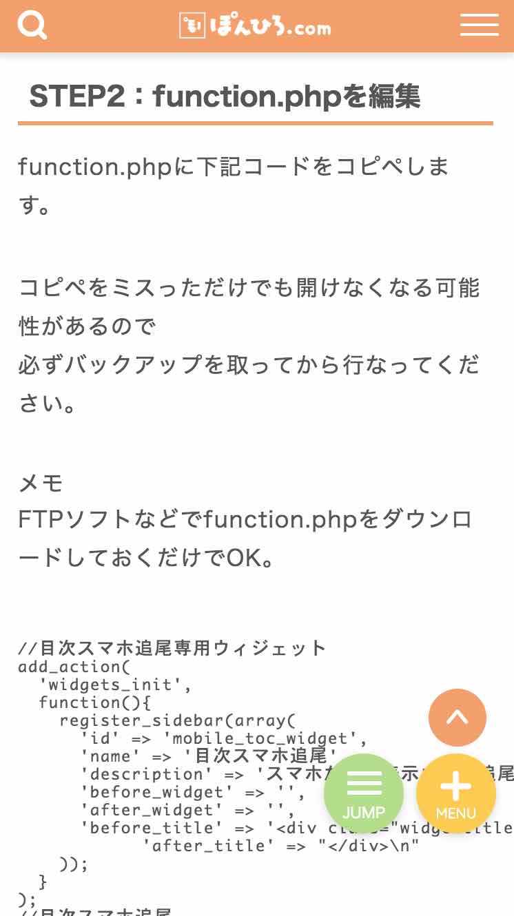
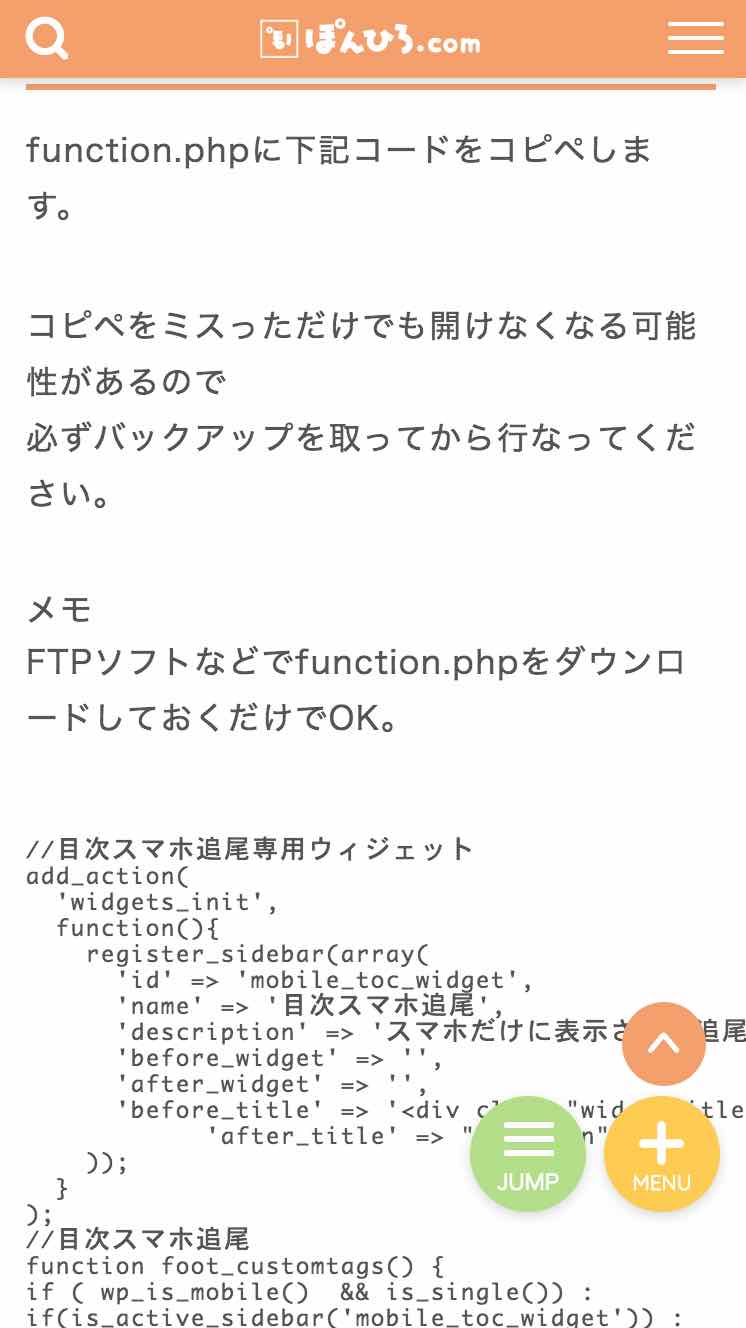
STEP2:function.phpを編集
function.phpに下記コードをコピペします。
必ずバックアップを行なってから進めてください。
//目次スマホ追尾専用ウィジェット
add_action(
  'widgets_init',
  function(){
    register_sidebar(array(
      'id' => 'mobile_toc_widget',
      'name' => '目次スマホ追尾',
      'description' => 'スマホだけに表示される追尾される目次専用エリアです。',
      'before_widget' => '',
      'after_widget' => '',
      'before_title' => '<div class="widgettitle">',
            'after_title' => "</div>\n"
    ));
  }
);
//目次スマホ追尾
function foot_customtags() {
if ( wp_is_mobile()  && is_single()) :
if(is_active_sidebar('mobile_toc_widget')) :
echo <<<EOM
<div id="mobile-toc-widget-wrap">
    <label for="mobile-toc">
    <div class="mobile-toc-button">
      <div class="menu-trigger">
      <span></span>
      <span></span>
      <span></span>
      </div>
     <span class="mobile-toc-button-title">目次</span>
    </div>
  </label>
    <input type="checkbox" id="mobile-toc"/>
    <div class="mobile-toc-show">
      <div class="mobile-toc-widget">
EOM;
dynamic_sidebar('mobile_toc_widget');
echo <<<EOM
</div>
</div>
</div>
EOM;
endif;
endif;
}
add_action( 'wp_footer', 'foot_customtags' );ボタンのラベル名を変更したい場合は29行目にある「目次」の名前を変更してください。
STEP3:JavaScriptをHTMLタグ設定にコピペ
JINにはJavaScriptを入力する箇所がないのでHTMLタグ設定を利用します。
HTMLタグ設定を開き、bodyタグの終わりの方に下記コードをコピペしてください。
<script>
jQuery('#mobile-toc-widget-wrap label').on('click', function() {
    jQuery('.menu-trigger').toggleClass('active');
});
jQuery('#mobile-toc-widget-wrap .toc_widget_list a').on('click', function() {
    jQuery('.menu-trigger').toggleClass('active');
});
jQuery('#navtoggle').on('click', function() {
    if (jQuery('#navtoggle').prop('checked')) {
        jQuery('#mobile-toc-widget-wrap').css('display', 'none');
    }else{
    jQuery('#mobile-toc-widget-wrap').css('display', 'block');
  }
});
jQuery('#mobile-toc-widget-wrap .toc_widget_list a').click(function() {
    if (jQuery('#mobile-toc-widget-wrap input').prop('checked')) {
        jQuery('#mobile-toc-widget-wrap input').prop('checked', false);
    }
});
jQuery(function () {
 var headerHight = 70;
 jQuery('a[href^="#"]').click(function(){
     var href= jQuery(this).attr("href");
       var target = jQuery(href == "#" || href == "" ? 'html' : href);
        var position = target.offset().top-headerHight;
     jQuery("html, body").animate({scrollTop:position}, 550, "swing");
        return false;
   });
});
</script>21行目のvar headerHight = 70;はリンクを選択した時に移動する場所を調整するものです。
ヘッダーを固定してることを想定していますので固定していない方は数値を小さくしてみてください。
EasyTOCを使ってる方は.toc_widget_listを.ez-toc-listに変更してください!
STEP4:ウィジェットで目次を設定
外観→ウィジェットを開いてください。
目次スマホ追尾というウィジェットが追加されていると思います。
そこに目次のプラグインTOC+を入れてください。
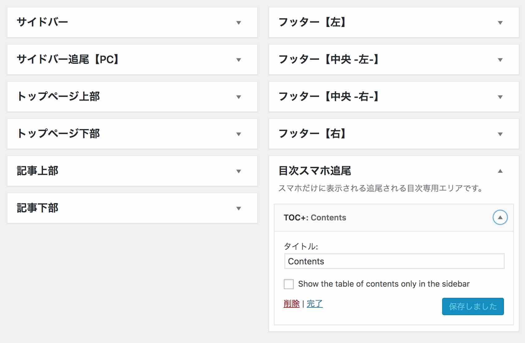
タイトルは自由に変更してOKです。
以上で終了です!
リンク後に見出しと固定ヘッダーが被ってしまう人
固定ヘッダーの人で目次リンクを押したときに見出しがヘッダーの後ろに隠れてしまう人。
こうなってしまう方はTOC+の設定を変更します。
設定→TOC+で
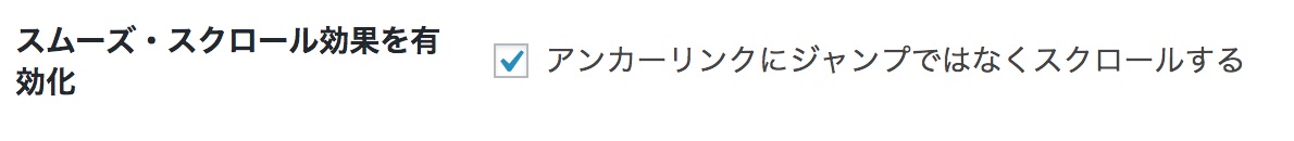
「スムーズ・スクロール効果を有効化」にチェックを入れます。
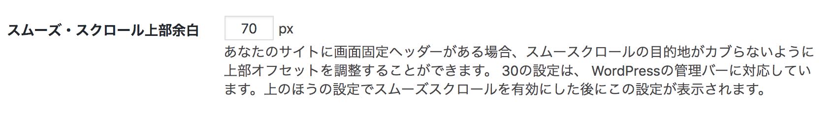
上級者向け表示を開き、
「スムーズ・スクロール上部余白」を70px(ヘッダーの高さ)に変更すればOKです。
導入済みのブログ紹介させてください
「この記事を見て導入したよ!」という方でSNSやブログでこの記事を紹介していただいた場合、こちらでブログを紹介させていただきます!
紹介したのに反映されてないという方は、大変申し訳ないのですがご連絡ください!
コメント
いつもデザインを参考にさせていただいています。
こちらも導入しようと思ったのですが、現在jinでは「TOC+」ではなくて、「Rich Table of Contents」という目次プラグインが推奨されています。そちらを使用した場合のカスタマイズも教えていただけるとうれしいです。
初めまして、いつもJINのカスタマイズでお世話になっています。
上記コメントの星野さんと同じように、私も目次プラグイン「Rich Table of Contents」で追従目次導入しました。
RTOCだと、コードのコピペだけでは目次の項目タップしても、目次が開いたままになってしまいましたが、JavaScriptのコードの「.toc_widget_list」の部分を「.rtoc-mokuji」に変更することで、上手く動作しました!
ボタンデザインもJINにピッタリで、とても嬉しいです。
ありがとうございます。
初めまして、いつも参考にさせていただいています。
function.phpに記載するとデザイン全体が崩れてしまい、ウィジェットも出てきてくれませんでした。
目次プラグインはTOC+です。
何か他のプラグインが干渉したりなどが原因でしょうか?
よろしくお願いいたします。